Custom themes
Make storyden match your community's character!
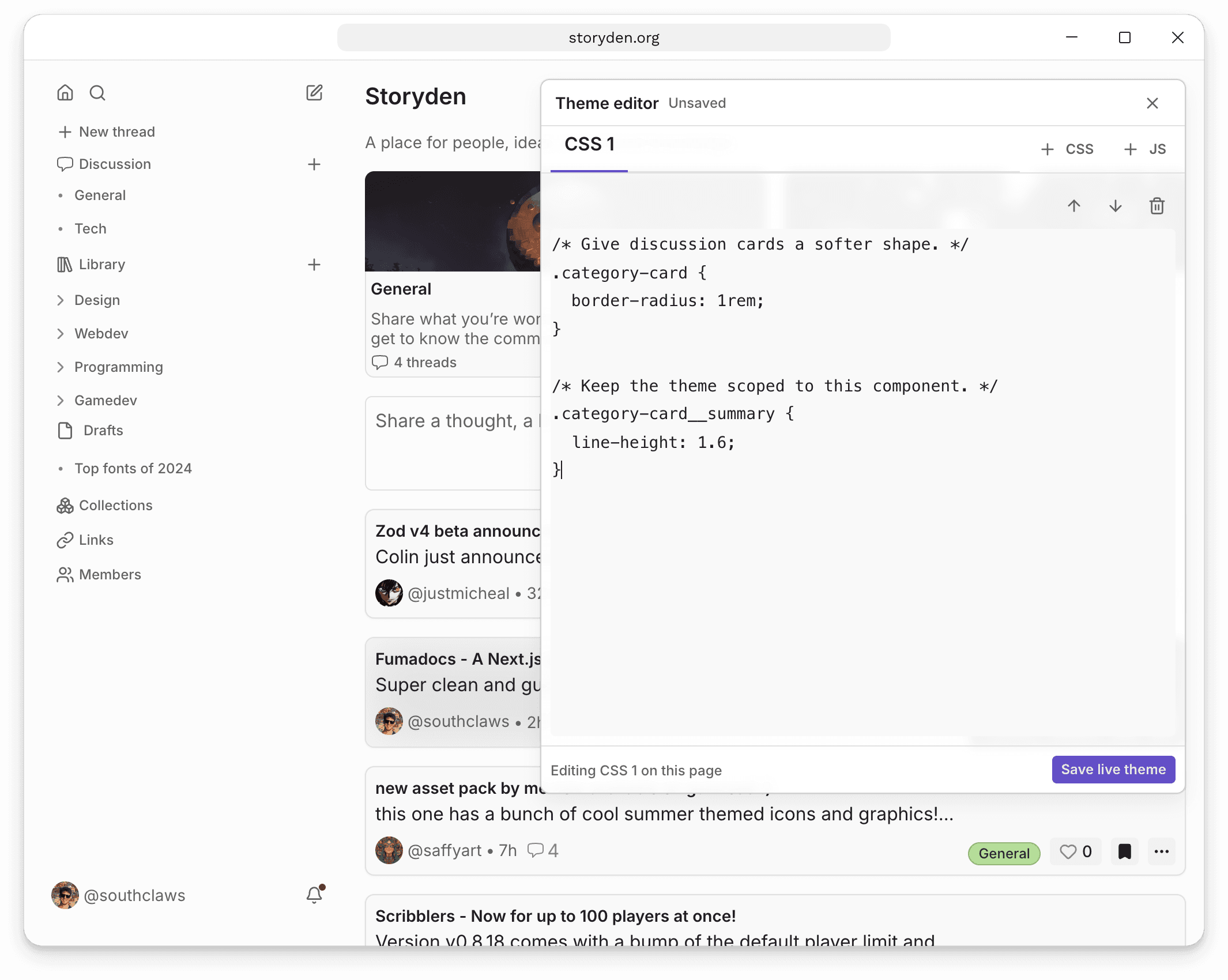
Custom themes let an administrator apply installation-wide CSS and JavaScript without rebuilding the Storyden frontend. Open Admin → Appearance → Custom theme, enable theme editing, and the editor will follow you while you browse the real site.
Changes are saved directly to the live site. You can inspect the page you are changing, use your browser developer tools, and save when the result is ready for visitors.
Theme code is trusted code
Theme JavaScript runs with Storyden's browser privileges for every visitor, including administrators. It can read authenticated pages and make network requests. Only paste code you have written or audited yourself.
Choosing a selector
Storyden exposes several kinds of CSS target. Choose the narrowest supported target that describes what you mean.
Context attributes
data-sd-* attributes describe broad semantic context rather than visual implementation:
data-sd-layout="default|fullpage"identifies the application shell.data-sd-region="navigation|sidebar|topbar|main|content"identifies major regions.data-sd-page="home|categories|category|thread"identifies product pages.data-sd-block="cover|title|subtitle|content|library|categories|quick-share|threads"identifies configurable home-page blocks.
Use these for rules that should affect an entire page or region. Avoid selectors that depend on the exact nesting between them.
Storyden BEM classes
Product-specific anatomy uses BEM-style classes such as .category-card__summary, .thread-page__replies, and .feed-page__block--cover. These are the preferred hooks when a theme needs to distinguish pieces of a Storyden feature.
Panda recipe classes
Generated recipe classes are supported component hooks because their names reflect a component's declared anatomy and variants. For example:
.menu__trigger {
  border-radius: var(--sd-radius-control);
}

.button--variant_solid {
  box-shadow: 0 0.2rem 0.5rem rgb(40 30 90 / 20%);
}
Panda utility classes such as .max-w_full, .min-w_0, or hashed/generated implementation selectors are not theme hooks. They may change whenever Storyden's internal layout changes.
HTML IDs identify real resources and fragment targets, such as a particular thread or reply. Do not treat dynamic IDs as styling hooks.
Public variables
Use the public --sd-* variables before reaching for individual components. They cover:
- canvas, surface, inset, overlay, and control backgrounds;
- primary, muted, and subtle text;
- normal, muted, and strong borders;
- the generated accent ramp, accent foreground, accent text, and focus ring colours;
- body and heading fonts;
- control, panel, overlay, and pill radii;
- content widths, sidebar width, and page gutters.
Use the administrator's accent colour
Storyden generates a light and dark 12-step accent ramp from Admin → Appearance → Brand → Accent colour. Custom themes should normally consume that ramp instead of declaring a separate brand colour. This keeps navigation, controls, focus states, and theme-specific surfaces in sync when an administrator changes the accent.
The reference frontend's accent picker changes hue only. The API accepts any CSS colour, but the generated ramp intentionally uses its HSL hue and supplies Storyden's own saturation and lightness progression.
| Steps | Intended use |
|---|---|
--sd-color-accent-1–2 | Tinted page and subtle backgrounds |
--sd-color-accent-3–5 | Normal, hovered, and selected control backgrounds |
--sd-color-accent-6–8 | Separators, borders, and focus rings |
--sd-color-accent-9–10 | Solid and hovered solid backgrounds |
--sd-color-accent-11–12 | Readable accent text |
Convenience variables expose the most common roles:
--sd-color-accentis the solid step;--sd-color-accent-emphasizedis its hover/emphasis step;--sd-color-accent-foregroundis readable text on the solid accent;--sd-color-accent-textis readable accent-coloured text;--sd-color-focus-ringis the stronger border step.
For example, this theme keeps its own surfaces but derives every branded colour from the installation accent:
:root {
  --sd-color-canvas: #f2f3f7;
  --sd-color-surface: #ffffff;
  --sd-color-text: #292b33;
  --sd-color-border-strong: var(--sd-color-accent-7);
  --sd-radius-panel: 0.65rem;
}

.category-card__summary {
  color: var(--sd-color-accent-foreground);
  background: linear-gradient(
    105deg,
    var(--sd-color-accent),
    var(--sd-color-accent-emphasized)
  );
}

@media (prefers-color-scheme: dark) {
  :root {
    --sd-color-canvas: #15131d;
    --sd-color-surface: #211e2b;
    --sd-color-text: #f4f2f8;
  }
}
Storyden follows the operating-system colour preference. The generated accent variables switch automatically. Define both modes for your own canvas, surface, text, and other theme values with prefers-color-scheme; do not assume that custom values will be transformed automatically.
Loading and lifecycle
Storyden serves the active stylesheets through /theme.css and scripts through /theme.js. The stable URLs are included in the initial HTML, so custom styles can participate in first paint without waiting for a client-side manifest request. The resources use ETags, allowing the browser to avoid downloading unchanged theme code.
Theme scripts are classic deferred scripts in their configured order. Storyden dispatches storyden:ready after hydration and storyden:navigate after client-side navigation. The navigation event includes the current pathname in event.detail.pathname.
React internals, undocumented DOM nesting, Panda utility classes, and window.__storyden__ are not public theme APIs.
Accessibility
Storyden's default interface targets WCAG 2.2 AA. Theme authors are responsible for preserving contrast, visible focus states, readable zoomed layouts, reduced-motion preferences, and keyboard usability in their custom code.
The repository includes an example theme for the open.mp project demonstrating light and dark palettes, public variables, BEM hooks, and recipe selectors.